This was a design challenge for an interview where I was tasked at creating a fictional email design. The brief was to design an email from header to footer to send to prospects and customers to promote an app (of the designers’ choice) which highlights 4 features.
The brief mentioned that the user should be captured and want to read the email content and be taken to external links such as a sign-up form or to download the app. The project owner wanted the image to stand out with a fresh look that captures the users attentions.
Scope
- Email to be designed from scratch
- Generic email that would be sent to customers and prospects
- No content provided
- Email should promote an app.
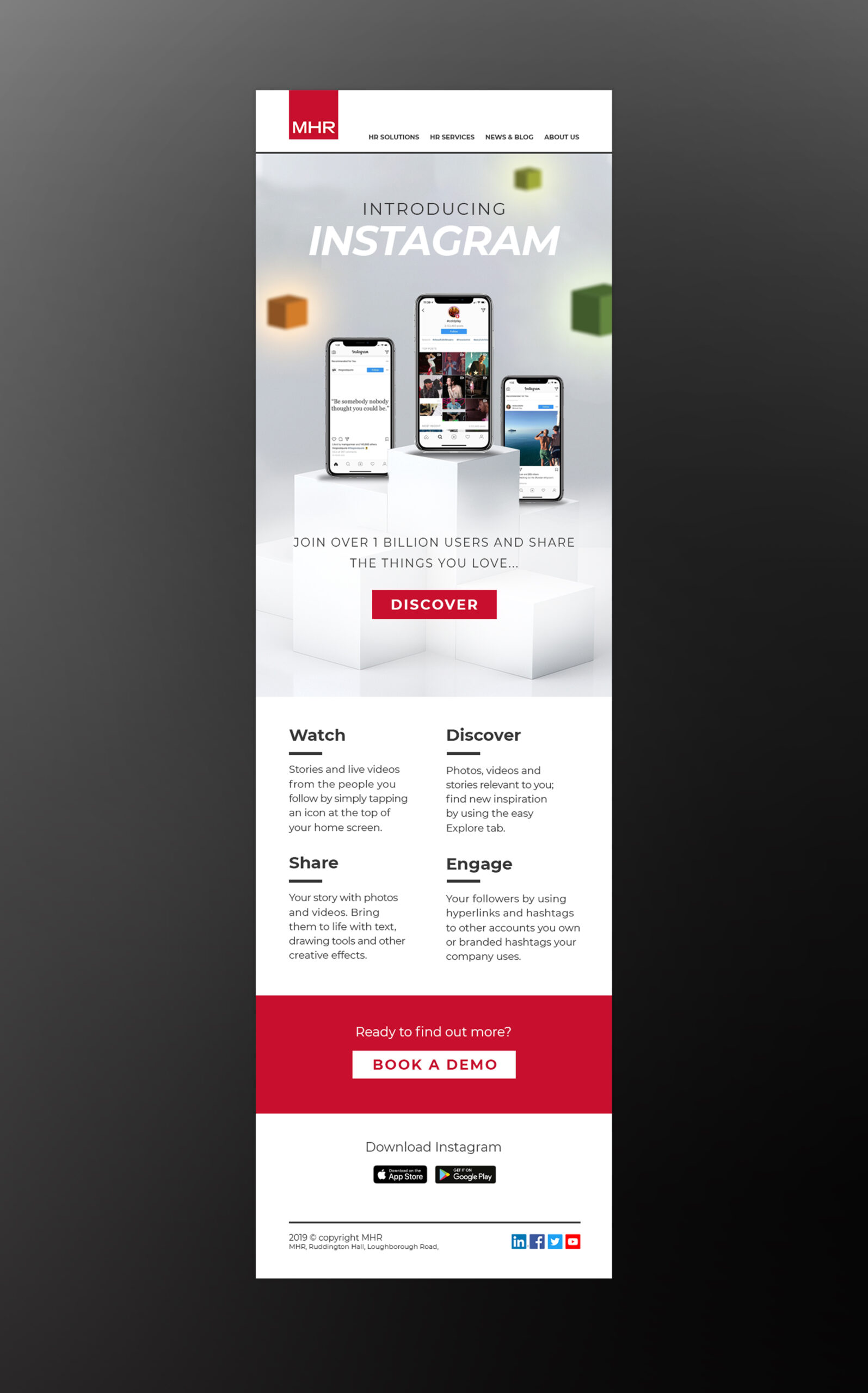
A Clean and Simple Design Showcasing the Product
As the company’s branding at the time used a lot of people imagery, I thought a strong concept would be to create some visuals that only featured the product, to stand out against the other competitor brands, and to make the email as simple as possible to take in for the user.
I made the app in-situ in phone screens stand on blocks to make a showcase of the email. Using a modern, clean and typographic focus to the headline image, I then looked at how to make the body features straightforward in terms of the amount of content as I needed to consider reading on mobile as well.
Outcomes
- Use of a longer impactful header image and punchy headline to draw attention
- Simple content and cta section with contrast, so it would be very easy to read.
