The Portman Group is the social responsibility body and regulator for alcohol labelling, packaging and promotion in the UK. Founded in 1989, it has over 150 code signatories from producers, retailers and membership bodies and it is funded by 17 industry leading member companies.
The body approached me about some branding work, where they wanted to create some variations of their logo to incorporate a strapline. These variations would be rolled out sequentially in the future, initially using just the current logo and new strapline and eventually using the strapline as the logo.
Scope
- Existing logo and brand that they didn’t want to change
- Several versions of the logo were needed to be created
- The strapline had to be created to fit with the current brand, but also work on its own
- There had to be considerations about sizes of the logo as it would be used in both print and on-screen collateral.
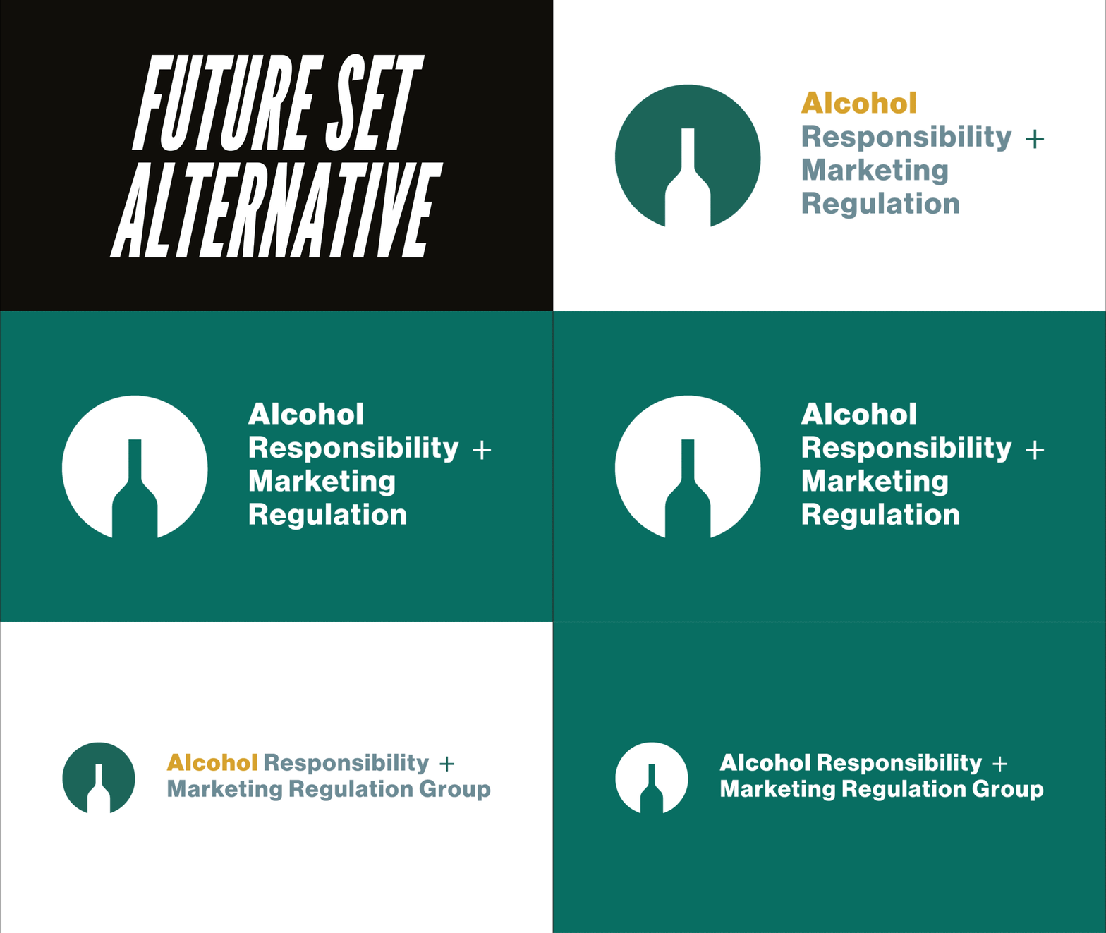
Creation of a flexible set of logos that work well in their marketing collateral.
The project involved creating several variations to future-proof the logo and strapline.
At different points in the future, they will eventually remove the main logo, and replace that with the new options sequentially.
The initial concept was to communicate that the name Portman Group, was still the dominant part of the brand.
The 2nd concept made the strapline have more presence over the Portman Group text.
For the final concept, the client wanted to use just the strapline as the logo.
During the review stages, I suggested some different typefaces that would still fit with the current logo until it was removed, and also work better at smaller sizes than the main brand font that they were using currently.
I also suggested changing the size and positioning of the bottle element in the initial logo to fit better as a design.
Introducing colour also really helped to break up some of the text elements of the strapline, as it was fairly long to read.
The logos had to work in both colour and on green backgrounds. I also advised on creating some horizontal versions for use in smaller spaces when needed.
Outcomes
- Initial logo and strapline concept
- Concept with the strapline being more dominant, but still keeping the Portman Group text
- Concept that uses the strapline as the main logo
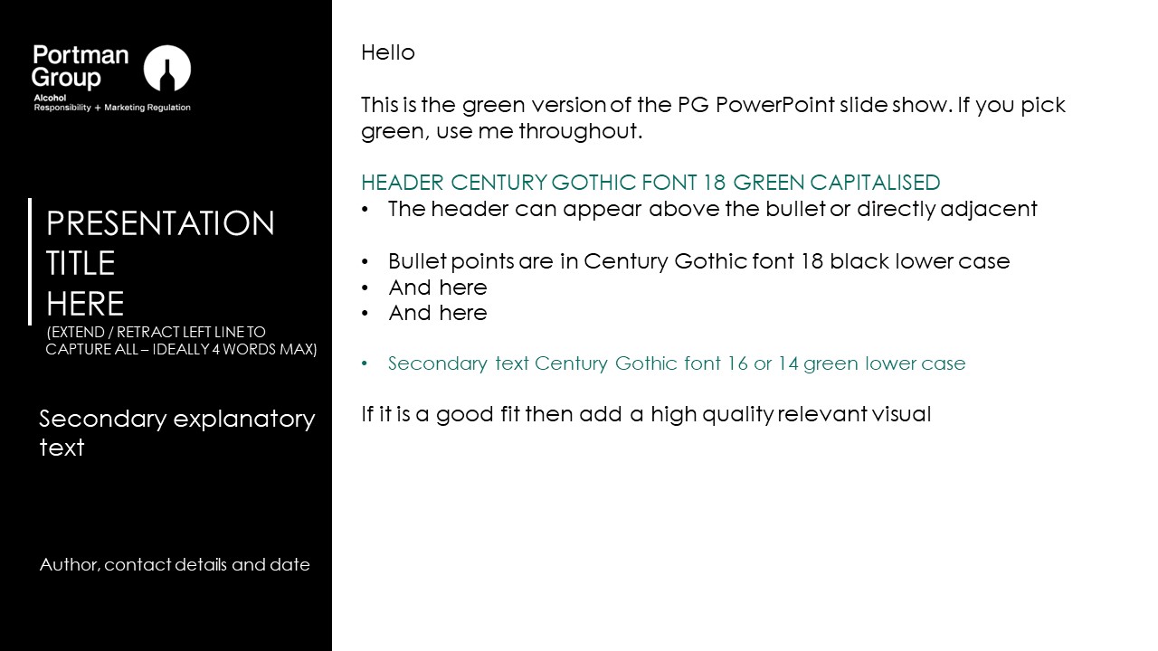
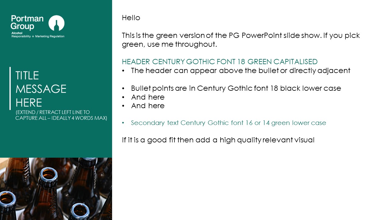
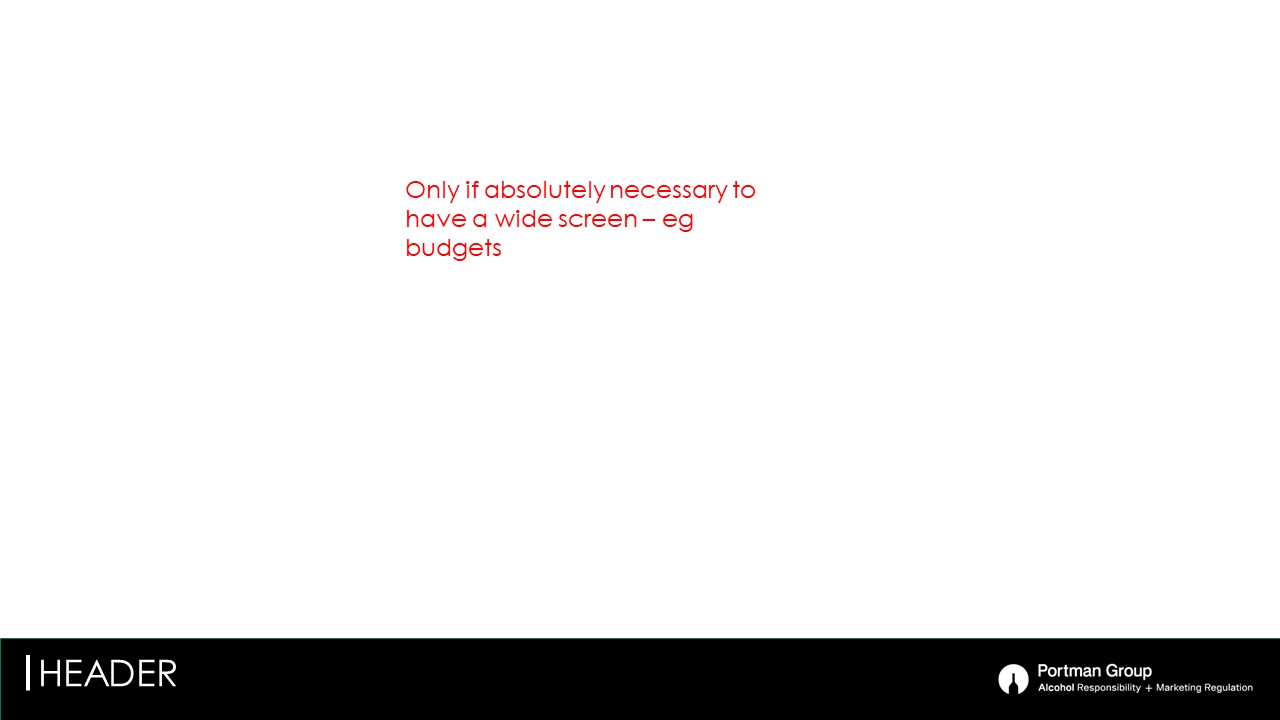
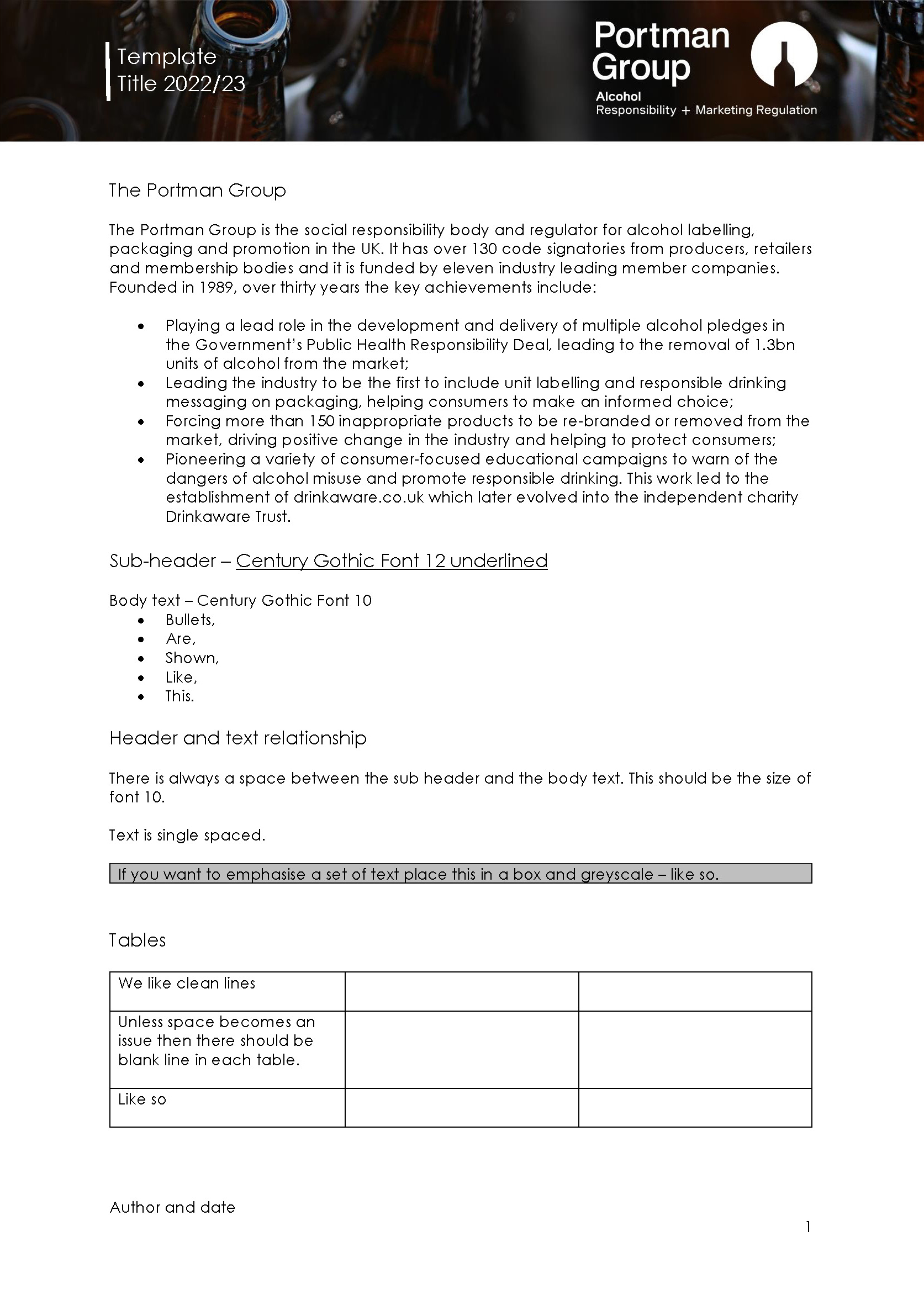
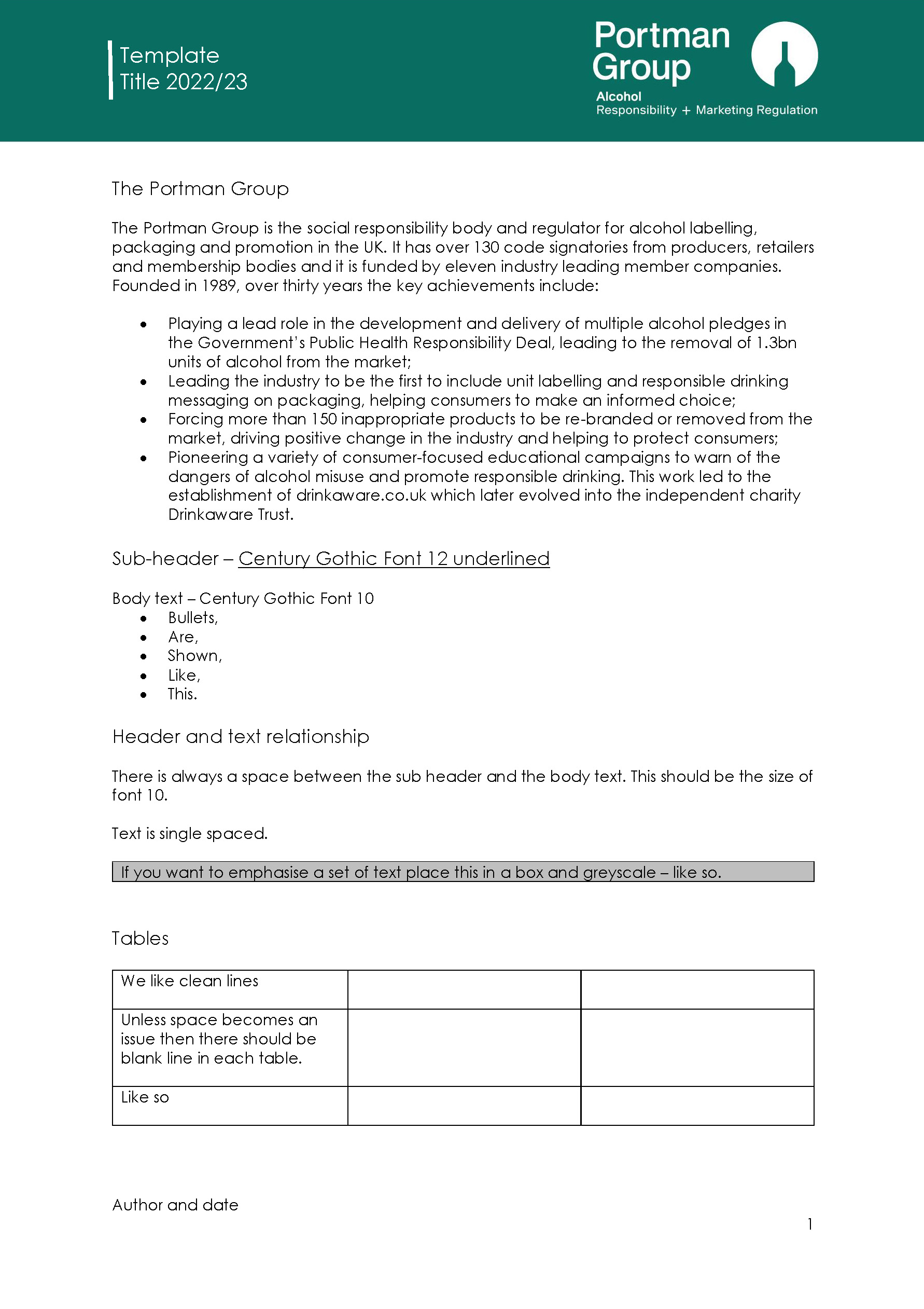
- Updated Word document and Powerpoint template.
